On Tuesday, Google’s Chief Product Officer, Neal Mohan, introduced a long-coming redesign to YouTube in its mobile and desktop platforms. Changes include interface makeovers for users watching on their monitors and more intuitive features for those on smaller screens.
YouTube’s design division is also rolling out experimental functions in a smaller scale as they try to match the video watching experience for everyone regardless of platform. The online service is not the same it was when it launched 12 years ago, and there is an impending need for unification across devices.
Google is finally aligning YouTube’s looks with other services of theirs, most notably the Google Docs suite, which has sported a material design-inspired interface for quite some time now. The tech giant is in the process of updating other relegated apps like Calendar to match their general corporate identity.
What’s new on the YouTube app?
Mobile users on both Android and iOS must have a pending or automatically downloaded update to YouTube incoming today. This new version of the video platform on mobile focuses on bringing beloved features of the desktop experience to the palm of your hand as well as new ones.
For instance, a fully mobile feature is making its debut after coming out of the experimental phase: double tap skip. By double-tapping on the right or left side of the screen, while playing a video, you can move forward or go back 10 seconds in the playback.
You can also slide your finger up to bring related videos while watching in full-screen mode. Speaking of which, the YouTube app now supports vertical video playback with no dark bars on the sides, and it does the same for square, 360, and more video formats by adapting automatically.
Mobile YouTube users will now get the chance to adjust the speed of the video, just like they do in desktop. Aside from that, Google is experimenting with a feature that will let people switch between videos by swiping left or right.
Notice anything different about us? 💁
We have several ✨new updates✨ rolling out over the next few days! https://t.co/HQ50o6960R (1/6) pic.twitter.com/oYo49zCRiG
— YouTube (@YouTube) August 29, 2017
YouTube desktop users are also in for a treat
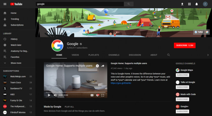
All viewers regardless of where they watch will get a new look inspired by Material Design seen across other Google products. The official logo has changed its typeface and dropped the Tube within a tube, opting instead for a brighter, red play button icon.
Desktop users will finally be able to watch YouTube videos using a Dark Theme interface, a feature that unfortunately did not make it into the mobile app in spite of other social media giants adopting the popular aesthetic.
YouTube vows to continue to evolve to support its ever-growing empire of video services, including music and premium video streaming. New format technologies are also undergoing development at the tech giant, including new VR alternatives for both videos and ads.
Source: YouTube


