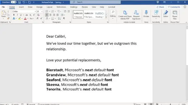
Microsoft will be replacing Calibri, its default Word font of 14 years, with another font in the next few months. Microsoft has been using Calibri as its default font since 2007 but felt it’s time to change to a new modern font. Five newer fonts have been shortlisted as possible candidates and these are Bierstadt, Grandview, Seaford, Skeena, and Tenorite.
In an emotional announcement revealing the plan, Microsoft wrote a passionate letter announcing the impending retirement of Calibri and detailed the intimacy enjoyed over the years with the exiting default Word document font.
“Dear Calibri, We’ve loved our time together, but we’ve outgrown this relationship,” Microsoft wrote. “Love your potential replacements.”
Microsoft is asking followers on Twitter to choose their favorite one out of the five potential replacements. The tech company said there is nothing wrong with Calibri and that the font served everyone well over the years, but that “it’s time to evolve” and “set a new direction”.
While a new font will be activated very soon, Calibri will remain an option and interested users will still be able to use it from the theme fonts dropdown. For now, users can download the five new fonts from the cloud and use any of them on any Microsoft 365 apps.
The original designer of Calibri, Lucas de Groot, said he is not worried in any way that Microsoft is switching to another font after using his font for 14 years. He said he designed Calibri in the early 2000s to enhance reading content on mobile, laptop, and desktop screens, Wired reports.
He said that he only modified some existing sketches he had to infuse some feelings into them since he was in a hurry while creating the font, little knowing that Microsoft would adopt it as its default font for Word documents as well as PowerPoint and Excel spreadsheets. He stated that “it’s a relief” that another font is coming up to take center stage now.
Simon Daniels, the principal program manager at Microsoft Office Design, said Calibri is not being retired as the default font for any particular reason other than the fact that “Calibri has gone out of fashion” and not because any users have issues with it.
Daniels said Microsoft is giving people the chance to pick their favorite out of the new five listed fonts so as to make users a part of the decision-making process in the design and implementation of their work tools. “You give somebody one, then there’s a good chance it becomes polarizing,” he said. “But if you give people five, almost everyone will have a favorite.”
Source: wired.com


