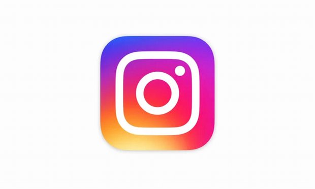
Instagram updated its logo on May, 11 and has gone from their ‘vintage camera’ to a more ‘modern camera’, where the logo is a mix of purple and yellow burnt in unison. Users on the internet have not shied away from expressing their dislike for the new logo.
Instagram put the announcement up on their blog, claiming the new logo is inspired by the old one, which retains the camera and the rainbow in a gradient form.
Designer Ian Spalter mentioned in a statement,
People are of the opinion that the new logo looks like a sunset, much like the image many users on Instagram tried to take. There was something about the rainbow in the old logo that the people really liked, and we wished to bring it into the new one in some way.
Along with the overhaul for their Instagram app, the company has also rolled out new logos for their editing apps: Boomerang, Hyperlapse and Layout.
The new Instagram logo bears the same outline of a camera like the old one, with a disappointing color scheme that has been likened with the ‘unfavorable gradient color schemes used for Microsoft’s PowerPoint’.
The inside of the Instagram app, however, maintains a simple design with colors that completely contrast the outer logo. The insides of the app are just plain black and white with, housing plain black icons at the bottom.
Moreover, Instagram rolled out the latest update on April, 26, where it added the ability to stitch different videos as one and post them online.
Facebook-owned Instagram, currently enjoys one of the largest photo sharing user-bases in the World and is also counted as the wealthiest amongst competitors. The app is available to download for free across most app stores and allows you to take, edit and publish your photographs amongst your friends, interest groups, and other social entities.


