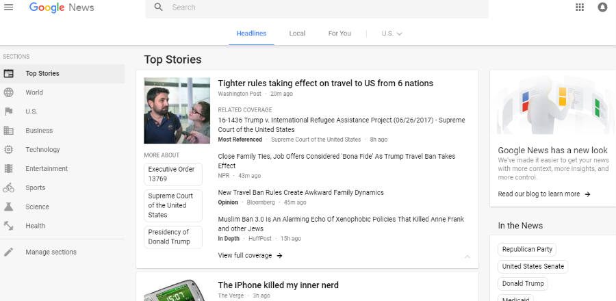
On Tuesday, Google News’ Product Manager, Anand Paka, announced the news aggregator platform was getting a new card-based redesign that made it “more accessible and easier to navigate.” The service has been updating over the last two days, and it is soon changing in mobile too.
While many have praised the material design facelift of Google News as a long-awaited update to the platform, many others who call themselves actual news readers have expressed their discontent with the new look.
In spite of the fact that the modernized version of the desktop website does feature customizable options and sections, many have pointed out that much of the space of the layout is wasted, resulting in less content to see at a glimpse and more unnecessary scrolling and clicking to get to the articles.
Readers have mixed feelings over the new Google News
Reactions to the updated Google News have been mixed, to put it mildly, ranging from those who have welcomed the overhaul because it looks like something from this decade to those who want Anand Paka’s head on a spike.
The supposedly streamlined version of Google News features the same three columns the old version had, but now the engine powering it is focused on “facts and diverse perspectives” instead of the condensed headlines model we used to know.
The left column has been scraped, and now it no longer features preview keywords of trending news and topics, having been changed instead to show only section names with an icon that makes them easier to identify.
Google News’ right column now has a Fact Check block dedicated to highlighting articles that dismantle fake news reports. Aside from that, the rearrangement has been criticized over the Sports Scores drop to the button and the lack of an option to bring it back up.
However, by far the most controversial change to Google News is the news articles’ presentation itself. Many consider that the “link-dense” layout of the old platform did not have to be sacrificed in exchange for “cleaner navigation.”
These claims become even more apparent when you browse the Headlines section of Google News. You will find only three cards with no preview text, and only two to three links per card take up the same home screen real estate that used to show way more information only a couple of days ago.
How to browse and customize the redesigned Google News
It is undeniable that the new Google News platform is easier on the eyes than the old one, and regardless of people’s opinions about information delivery, there are a couple of neat things readers can do now to find out what’s happening around the world and the latest updates about their interests.
For starters, you are presented with nine standard Sections on the left sidebar that you can hide but not delete. You can, however, add your own section based on search queries and name it however you want for easy access below the others.
Secondly, the top bar has been modified to show Headlines, Local news, articles For You based on your search data, and a Location selector to change your home region.
There’s nothing you can do about the Headlines, but you can customize the Local and For You feeds to your liking. In the For You stream you can add new interests so that Google shows you stories based on those topics, while the Local feed takes your location by default and you can add more on the left sidebar.
You can change your preferences and make all of these additions in Settings, where you will also find a new Sources manager to select your Preferred sources if you wish and blacklist others you enter in a Blocked sources list.
In General Settings you can enable or disable standard options like opening articles in new tabs, automatically refresh feeds, and show sports scores as well as which leagues to follow.
When selecting a story card, the same news segments of the old Google News like Most Referenced, Highly Cited, Opinion, and more are still there, but the tech giant has added more labels like the recently introduced Fact Check to distinguish articles from others as much as possible.
Noticeably absent from this new version is the Real Time Coverage option that showed fresh articles as they came out, but a silver lining is that the built-in video player and Featured Videos block on the right sidebar have been upgraded to be better and more intuitive.
The new version of Google News will start rolling out in mobile devices over the next couple of days. There is a Feedback link at the bottom of the page where you can describe any issues you’re having or share improvement ideas along with a screenshot and send it to the company.
Source: Google


