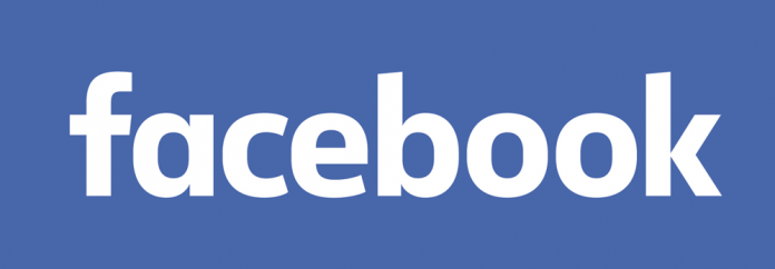
Facebook (NASDAQ: FB) recently updated its logo. Designed by Facebook’s in-house designers and famous typeface designer Eric Olso, the changes are so sapient that one could easily miss the update. But in the world of typography, it is definitely distinguishable. The logo is an important aspect of any business trade. It is a cornerstone of company’s overall branding language.
The creative head of Facebook, Josh Higgins says:
“While we explored many directions, ultimately we decided that we only needed an update, and not a full redesign.”
He explained that Facebook’s in-house designers created custom lettering to make the logo “feel more friendly and approachable”.
How you can spot the difference in the new Facebook logo
Here are the differences that you will notice in the new Facebook logo.
- The modification is largely done in terms of typeface.
- The letters are thin and cursive.
- The counters in each character are lined up nicely.
- Designers have introduced more white space between each letters.
- The “a” is simplified, rounded off and has been changed from double story to a single story.
- Basically, they have moved from old Greek English letters to the new school cursive writing.
- According to the current trend of typography, the intention seems like a smart move.
This update also speaks about the trend of using mobiles. Making the letters more clear and by increasing the white space, the logo will look much better on smartphones and tablets. Facebook’s last logo was created in 2005 but this year the social media company decided to revise it and make it more mobile friendly.
From a brand design perspective, it is a welcoming change. However, there is nothing great about it. The updated design will soon debut across mobiles and web in the future, but the large “F” logo and favicon will remain the same.


